- Gold $0.00 $0.00
- Silver $0.00 $0.00
- Platinum $0.00 $0.00
- Palladium $0.00 $0.00
Recent Economic Indicators
Why NOW Is the Time to Rebalance

As the stock market continues its longest Bull Run in history, volatility is increasing, consumer confidence is dropping, and signs are building all around that the end may be drawing near.
The below charts show why analysts and investors are becoming increasingly worried that the amazing growth of the stock market, which has been going on for more than 10 years, is past-due for a major correction.
And this time, the crash could be bigger than ever.

Printers are Running as the US is on Lockdown
Extended lockdowns are starting to wane the idea of a V shape recovery by the economy. The states that have prolonged their individual lockdowns will potentially seek bailouts from the government that could have downstream consequences of dollar printing on a scale never seen before.
Source: Washington Post + Wall Street Journal

Never-ending Tax
Taxes are everywhere. The most recent $1,200 stimulus may seem like a free handout now, but it really is a forward on what you own the government next tax season.
Bailouts, handouts and assistance programs are heaped on the ever-growing U.S. Government debt. This will be paid somehow, someway. Take the country of Cyprus, not too long ago, their government tried to take 10% out of everyone’s direct bank account and personal property to settle the government debt. This is only a public showing. The U.S. and state governments take it in the form of property tax, sales tax and the silent tax, inflation.
Our firm recommends quarterly rebalancing to make sure you are giving your portfolio the review and updates it needs.
Source: AARP

Modern Alchemy: Wall Street
As CLOs managers purchase debt, they split junk rates bond purchased in bulk and offer investment at different tranches. The original bulk bond purchase contains a variety of rated bonds. By splitting and identifying bonds above a BB rated loan, the CLO manager can offer it as “investment grade,” These “investment grade,” tranches are rebranded without changing risk in the debt purchase.
Source: ZeroHedge

Rebalancing Works
This graph shows how consistently rebalanced portolios out-perform the unbalanced portfolio, regardless of whether the rebalancing was done yearly, semi-annually, or quarterly.
Our firm recommends quarterly rebalancing to make sure you are giving your portfolio the review and updates it needs.

The Longest Bull Market in History: When Will it End?
The current Bull Run in the stock market became the longest in history in August of 2018. This chart was created at the end of June 2019, so the dark blue bar representing the current Bull Run is actually continuing to grow.
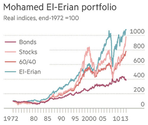
The Mohamed El-Erian Portfolio
This chart shows the performance of a portfolio designed by Mohamed Aly El-Erian, who currently serves as the chief economic adviser at Allianz, the corporate parent of PIMCO. The El-Erian portfolio contains a 7% allocation of gold and has far out-performed the indicated asset classes over time.

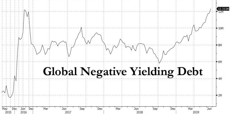
Bond-Buyers Locking in Negative Yield
This chart shows global negative yield debt that is being held. In June, the amount of debt with a negative yield hit a record high.
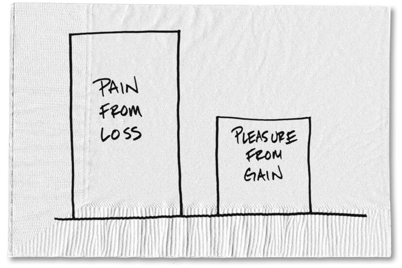
Manage Investments Through Logic, Not Emotion
Professor Daniel Kahneman from Princeton University won the 2002 Nobel Prize in Economics for proving that humans are more than two times more likely to try to avoid loss than they are to attempt gain.
When you apply that non-rational human nature to investing, it results in lower returns on your portfolio. It’s emotionally difficult to rebalance an investment portfolio when it means selling some of your winners to add more of something that may not be doing as well.
But, when you rebalance methodically, your portfolio is rewarded with both higher long-term returns and better protection through downturns.
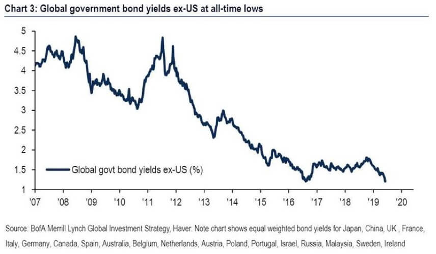
Global Government Bond Yields Nosedive Even as Stocks Climb
This chart shows international bond yields over the last 13 years. With recent dips, the yields are the lowest that they’ve ever been. Analysts suggest this is a major sign that the economy isn’t as strong as the stock market may indicate.
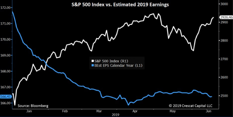
Stocks Going up While Earnings Go Down
This chart shows the relationship between stock prices (the S&P Index) and the companies’ estimated earnings so far this year.
At the start of 2019, the balance looked pretty healthy, but ever since February, the trend has reversed, with stock prices going up, and earnings going down, or flattening out.
This is a sign that the buying spree is driven more by speculation than by actual fundamentals.
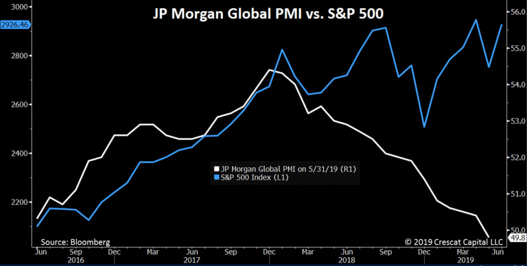
A Look Inside the Boardroom Shows the Scary Truth
This chart from JP Morgan is based on the Purchasing Managers Index (PMI), which is created from the results of a survey of senior managers based on their companies’ expected new orders, inventory levels, production, supplier deliveries and employment.
This "behind the scenes" look at company activity can serve as an excellent barometer of future business expectations. Whenever it dips below 50, it means that the next month is expected to be slower than the month before.
In the chart, a divergence occurs where the S&P 500 goes up, even as the PMI starts to go down, indicating that actual expected company activity just doesn’t support higher stock prices.
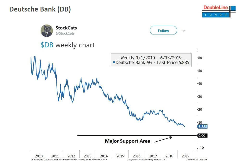
Germany's Largest Bank Is the Canary in the Coal Mine
This chart tracks the stock performance of Deutsche Bank. The poor performance is a result of the bank’s weak mix of assets, including a heavy position in risky derivatives.
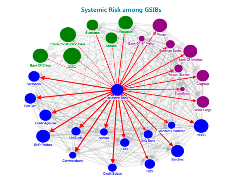
When One Bank Fails, it Affects Them All
This image shows how complex the banking system is. All of these big banks own pieces of each other. When any one of them is in trouble, it’s a signal that the problem may be a lot deeper than people realize.
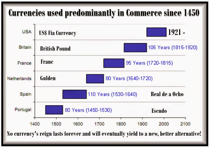
Cash Isn't as Safe as it May Seem
The issue isn’t just confined to the stock market. This chart shows how the world’s currencies change in importance over time.
This data shows that the typical domination lifespan of a currency is about 95 years.
The U.S. dollar has reigned supreme since 1921. That’s just over the average lifespan.
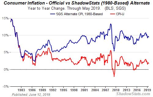
Inflation Is Higher Than Has Been Reported
Government-reported inflation rates fail to tell the full story. This chart shows how inflation is significantly higher than generally reported, since the official figures do not include some of the staples of the American economy. When you include the "shadow inflation," the buying power of the U.S. dollar is actually losing about 7% each year.
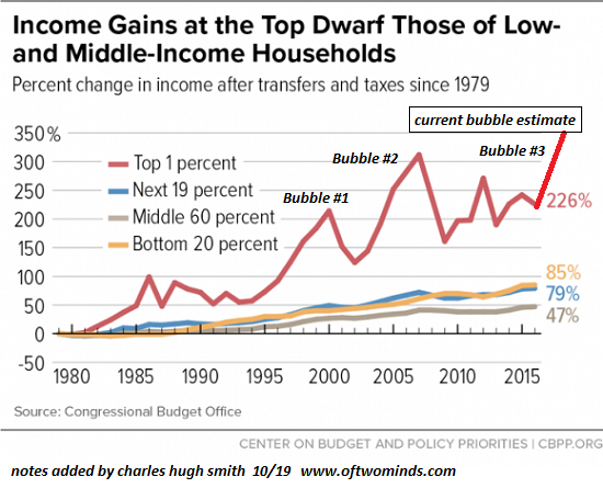
Income Gains at the Top Dwarf Those of Low Income and Middle Income Households
Income gains for the top 1 percent of Americans are significantly higher than those even in the class directly below. The "trickle down" effect is not evident in this view of bubble income gains.
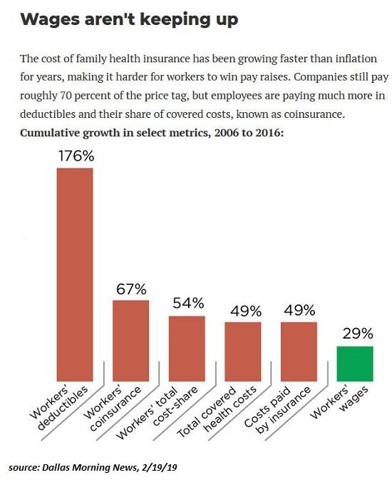
Wages Aren't Keeping Up
With the increase in heathcare costs are outpacing inflation and digging into the take home pay of American workers.
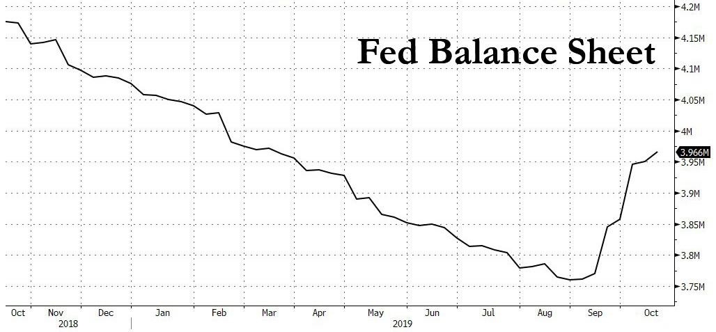
Fed Balance Sheet
$30 billion term repos to ease funding conditions around quarter end, which confirms that the rebound in the Fed's balance sheet - the first in almost five years - is anything but temporary.
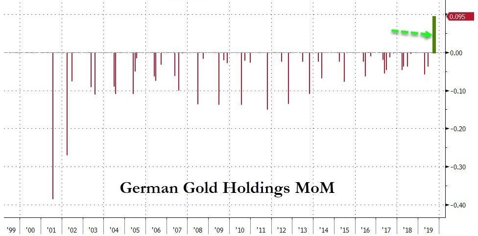
German Holdings Month Over Month
For the first time in 21 years, Germany has openly bought gold into its reserve holdings.
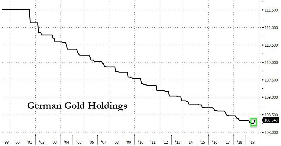
German Gold Holdings
Germany's overall gold holdings in conjunction with the repatriated 583 tonnes, or $31 billion worth, of gold in 2017.